Sooooo, site is now moved to its new server. Soooo many things went wrong during the move. I've been with that old server for so long that I had forgotten how much of the code was written to get around issues with their service
There are still problems, mostly formatting on the forum (like the better integration?) and I forgot to add the subdomain until a few minutes ago (kinda moving away from that thing).
Next step is catching up with a couple weeks of no updates, tagging everything (a,k,a, a living hell), and generating a story post for EqD. Once that's done, I'll start on putting together a completely new theme for the site using some ideas from my abandoned WIP site as well as ideas from a couple reddit posts
Let me know here, on in an email (submit link would be fine) if there are any issues (I know about the ton of missing thumbnails, blame deviantArt and FimFiction for constantly changing their paths). For now, I go to sleeps, nighty night!
New Server
- Arcane_Scroll
- Site Admin
- Posts: 490
- Joined: Sun Jul 03, 2011 11:06 pm
- Location: Minnesota
- Contact:
- TyrannisUmbra
- Global Moderator
- Posts: 523
- Joined: Tue Oct 18, 2011 4:46 am
- Contact:
Re: New Server
Looks a liiiittle derpy right now, but with a bit of polish I think the site integration could turn out really good! Gonna take a bit of getting used to, though.
Primary IRC nicks: TyrannisUmbra, Silver_Wing
Current PNP characters: <Non-FoE Only>
- SilverlightPony
- Global Moderator
- Posts: 493
- Joined: Sat Mar 17, 2012 4:21 pm
Re: New Server
Forum/non-forum integration is hard to do well, and I generally prefer to keep them separate.
My nitpicks at present:
The mixing of the mainsite theme and the forum theme looks awful. Brown and blue aren't exactly complementary colors. Looks like this is already on your to-do list, though.
Bits of the forum layout and styling are broken, making it look even worse. I'm sure you've noticed some of them, but the most glaring ones are the display/sorting pulldown lists at the bottom of thread view pages. Their width is fixed to the width of the message display area, which is already far longer than they need to be, but it doesn't take into account the other stuff that's in-line with them--the text on the first two and the "go" button after the latter one--causing them to stretch the page out and create an unnecessary horizontal scroll bar, no matter how wide you make the window. Those pulldowns don't need to be more than 100, maybe 150 pixels wide.
On a more subjective, personal note: I utterly despise having sidebars--especially on forums, but I'm not overly fond of them on non-forum pages either. They take up valuable screen/window real estate that I'd much rather use for actual primary page content; it's in the way. This is the main reason I dislike embedding forums in mainsites like this--they almost always leave a sidebar. If it stays like this, I'll be looking for (or trying to make) a Stylish plugin to hide it. >_<
Re: New Server
hi hi
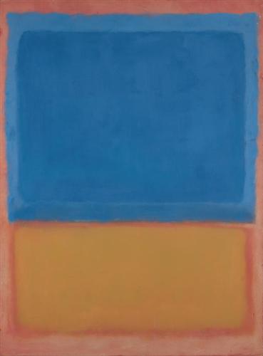
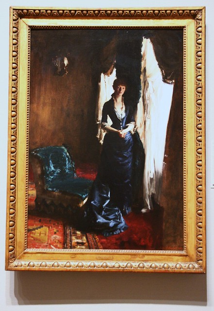
I hate to nitpick a nitpick, but actually, brown and blue is a textbook complementary color scheme. Most browns, including the one used on this site, are shades of orange with low lightness and/or saturation. On both the conventional, and the Munsell 5 point color system, blue and orange, or blue and yellow/red, are direct complements.
But don't take my word for it, some world famous painters have been using brown/blue for quite some time.
Spoiler: show
- SilverlightPony
- Global Moderator
- Posts: 493
- Joined: Sat Mar 17, 2012 4:21 pm
Re: New Server
It still looks bleh.
- Arcane_Scroll
- Site Admin
- Posts: 490
- Joined: Sun Jul 03, 2011 11:06 pm
- Location: Minnesota
- Contact:
Re: New Server
Yep, forum theme is getting a makeover, as is the entire site (worked on it some today).
If you decide you need to make a Stylish plugin for it, let me know and I'll add an ID to that entire column to make it easier to hide (would just require css "display:hidden;" on that ID)
Well, you'll be happy to hear that I despise side bars too and have wanted to kill that one off for a very long time now. Next layout change will instead have a top navigation bar and the rest of the site will be full width. As for when this happens, soon I hope. Not going to have a lot of time until this weekend.SilverlightPony wrote:On a more subjective, personal note: I utterly despise having sidebars--especially on forums, but I'm not overly fond of them on non-forum pages either. They take up valuable screen/window real estate that I'd much rather use for actual primary page content; it's in the way. This is the main reason I dislike embedding forums in mainsites like this--they almost always leave a sidebar. If it stays like this, I'll be looking for (or trying to make) a Stylish plugin to hide it. >_<
If you decide you need to make a Stylish plugin for it, let me know and I'll add an ID to that entire column to make it easier to hide (would just require css "display:hidden;" on that ID)
icekatze wrote:I hate to nitpick a nitpick, but actually, brown and blue is a textbook complementary color scheme. Most browns, including the one used on this site, are shades of orange with low lightness and/or saturation. On both the conventional, and the Munsell 5 point color system, blue and orange, or blue and yellow/red, are direct complements.
Re: New Server
Well sweet, new server! Anyways I moved this topic to be in the "annoucements" section even though site discussion was a good place for it.
Anyways I'll just leave a bag of blackjacks here...
"Sometimes, being honest means knowing when not to be."
"Youth leads to mistakes, mistakes turn to pain, pain gives way to anger, anger drives a wedge into harmony."
"Who is to say we are not insane? We're all a little bit insane. You just have to hide it."
"To be forgotten is worse than death."
"I dreamt of the end of the world and a sea of regrets."
"Youth leads to mistakes, mistakes turn to pain, pain gives way to anger, anger drives a wedge into harmony."
"Who is to say we are not insane? We're all a little bit insane. You just have to hide it."
"To be forgotten is worse than death."
"I dreamt of the end of the world and a sea of regrets."