This is the best Fallout font I've found, matches perfectly.

A really nice Friendship is Magic font. The latest version now includes lowercase characters (I should redo my buttons on the site)


Well, starting chapters on the inner page for one, it's not how a book is supposed to be formatted. A chapter is not supposed to start on an even page number, although I'm aware it is done in many books, it is never considered proper. The page numbering is starting on the title page for some weird reason. Also, there is no TOC, I will add one to my printing. I want to add a glossary to the end for terms the reader might not understand.Rppirate wrote:Which formatting do you disagree with? Just curious.
The overall vibe in the group really bothers me. It's just not "fun" or even happy, a couple members are doing everything they can to micro-manage things and it's all rather depressing.otherunicorn wrote:The whole "who's paying, who's lying" business has me rather miffed.
I agree on the too good to be true bit actually. I did make comments to the effect in the thread at one point and was largely ignored.Arcane_Scroll wrote:I'm just going to print my own copy, I never trusted that 100 free copies thing, was too good to be true.
I'll try to put up tutorials as I progreses for anyone who wants to print it out themselves.
BTW, don't remove the cutiemarks, that makes no sense.
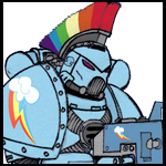
 More art, but it is over 200pix high.